
Since November of this year we have been working on a complete redesign of the booking experience for all businesses that do not currently use the embed experience. We wanted to share some details about these updates so that you can familiarize yourself with the new features and functionality.
Not to worry if you are an embed experience business and wonder why you didn’t get this update. In the coming months the embed experience is going to be completely rewritten and once that happens you will have the ability to opt-into the new experience.
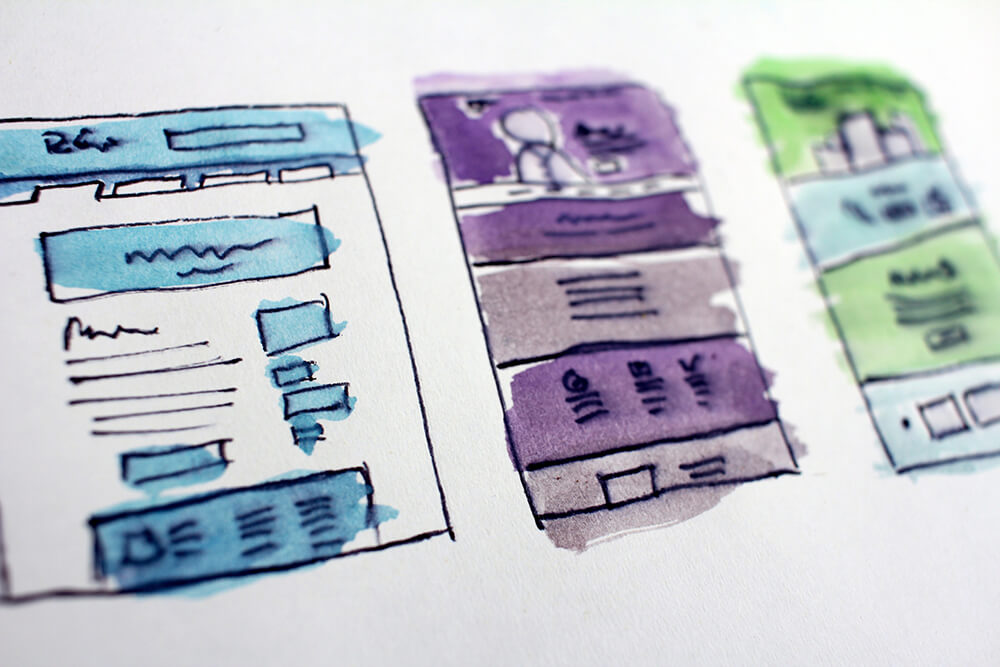
The redesign comes after many hours of user research and consult with experts in the fields of design, user experience, and customer experience. The ultimate goal: help you sell smarter.
Product Grid
The product grids have been cleaned up and showcase images more than text. The sub-titles and short descriptions appear only when a user hovers and only on non-mobile experiences. This helps the user interact more with the imagery the business has uploaded and not overwhelmed with extra information.
By Date Activity View
We are extremely proud to have completely redesigned the by date activity view. Our data shows that customers love to find activities using the date view so we knew we had to improve this dramatically. The first major change is the entire experience is now mobile-friendly. Both mobile and non-mobile show users available activities for a given day and still allow users to filter activities in a number of ways.
Product Details
The product details page features a cleaned up design of the availability calendar, streamlined price and quantity selections, and an overall cleaner and easier to read details layout. Products with multiple images will still cycle in a carousel but on tablet, desktop, and wide-screen experiences the user will be able to see more images at once and not take up as much space for the images.
Additional details like available add-ons or sub-descriptions have been moved to an accordion system to allow for more intuitive navigation and a cleaner experience.
Purchase Path
The entire purchase path from invoices to checkout and even review and confirmation pages have also been completely redesigned to be easier to read and navigate. Users no longer have multiple call to actions and the overall layout should make it easier for a customer to understand exactly what they are buying and what needs to happen to make a purchase.
As always the customer has the option to print their confirmation and that view has been enhanced as well. The customer will also receive an enhanced confirmation email that is cleaner and easier to read and should help the customer find the information within their email easier. We’ve also added email schema markup so customers that use GMail should have an enhanced experience in certain situations.