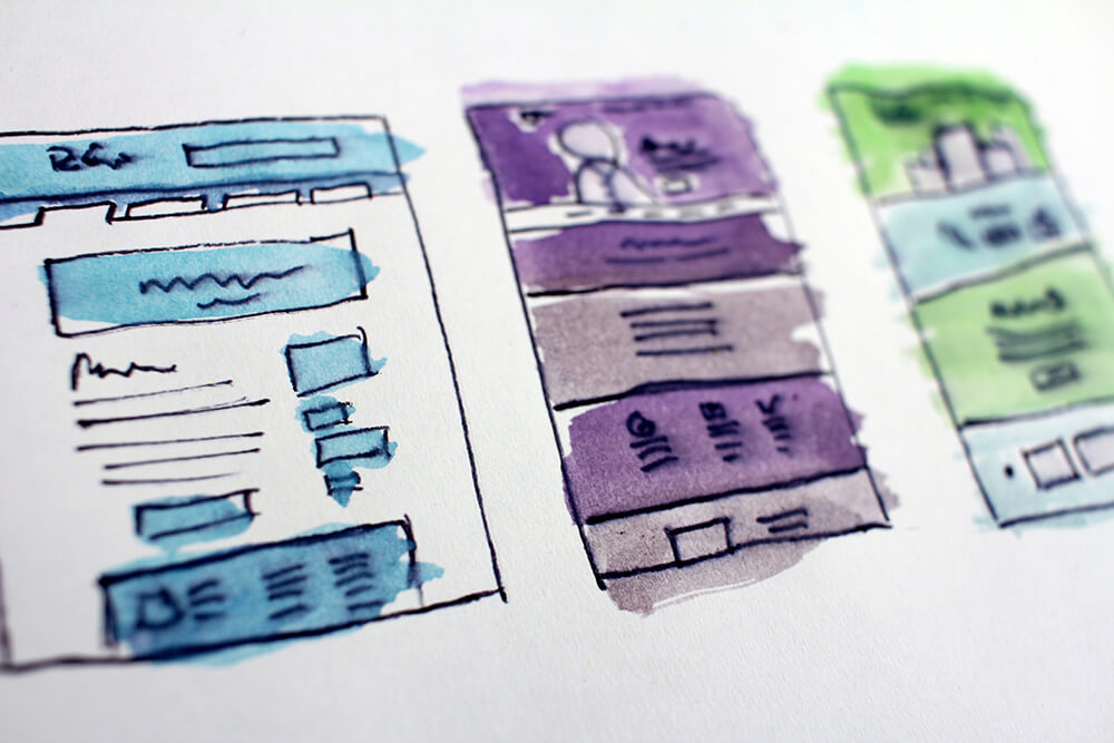
Today I am excited to announce a new version of our embedded booking experience and wanted to share what to expect and what’s new in this new version.
We’ve completely rewritten the entire embedded experience, using what was learned from the previous version as well as client and customer feedback to produce this new, even more streamlined experience.
Overall we’ve cleaned up the appearance of the experience dramatically which should make it easier for customers to use and book. The entire objective is to get your customers to book and to book direct so we’ve made it easier for them to do just that. The cart is easier to find and easier to see what is in your cart currently. Likewise, it’s even easier to select the language you wish to use, as well as alternate between languages easily.
Product Grid
Like on the booking experience, the product grids have been cleaned up and showcase images more than text. The sub-titles and short descriptions appear only when a user hovers and only on non-mobile experiences. This helps the user interact more with the imagery the business has uploaded and not overwhelmed with extra information.
It’s now easier for a customer to navigate back to a category listing and when they do, they’re also taken back to the same product type they were viewing previously. This is a much better and clearer user experience for the customer.
Product Details
Just like on booking, the embedded product details page features a cleaned up design of the availability calendar, streamlined price and quantity selections, and an overall cleaner and easier to read details layout. Products with multiple images will still cycle in a carousel but on tablet, desktop, and wide-screen experiences the user will be able to see more images at once and not take up as much space for the images.
Additional details like available add-ons or sub-descriptions have been moved to an accordion system to allow for more intuitive navigation and a cleaner experience.
Purchase Path
The entire purchase path from checkout to confirmation pages have also been completely redesigned to be easier to read and navigate. Users no longer have multiple call to actions and the overall layout should make it easier for a customer to understand exactly what they are buying and what needs to happen to make a purchase.
As always the customer has the option to print their confirmation and that view has been enhanced as well. The customer will also receive an enhanced confirmation email that is cleaner and easier to read and should help the customer find the information within their email easier. We’ve also added email schema markup so customers that use GMail should have an enhanced experience in certain situations.
But My Experience Didn’t Change…
Yes, that’s correct. Given the large nature of this change we couldn’t push this update out immediately to all clients that use the embedded experience. Instead this will be an opt-in model. We will slowly be migrating TRYTN website clients to the new experience over the coming weeks and will be reaching out to others to encourage them to update.
The old embedded experience will persist for the time being until clients have migrated off of it. Note that we will start deprecating the old experience in the future, meaning you may not have access to new functionality as it’s released if you continue to use the old version. We’ll make sure to announce the full deprecation of the old experience before it’s fully deprecated.


